Thanks to the generosity of our business supporters, Treetops Hospice is unveiling a fresh, new brand and logo
We were in the middle of reviewing our brand last year when the Coronavirus pandemic struck. We put everything on hold to quickly adapt our services to continue to support the most vulnerable patients. For example, we launched our Roaming Nurse Service and loaned out tablets to help our patients get online so that we could continue to support them.
We reached out to our supporters and almost 300 people responded. They said that the level of care provided by Treetops was outstanding. However, they recognised that securing funding was our greatest threat.
Many also said that the brand had become tired and no longer reflected the progressive care that we've been offering throughout the pandemic.
We listened
“We listened, and we’re working really hard to raise income and build awareness, but a distinctive new brand was out of reach." says chief executive Julie Heath.
“It’s widely accepted that people are more likely to donate to a strong brand, but we couldn’t justify the spend, especially on big things like the design and the shop signs. Then some wonderful businesses stepped in to help.”
Incredible support from local businesses
IE Brand donated a lot of their studio time and MX Display are replacing all of the shop fascia signs for free. Marketing experts, Qinesis and Picture Window have also expertly helped and guided us along the way.
We’re thrilled with our new, modern and caring look and we’re grateful for all the help and encouragement we’ve received in getting it to this stage.
To save money, we’ll introduce the new brand over time and replace things as they need replacing, so please bear with us.
A community bonding together
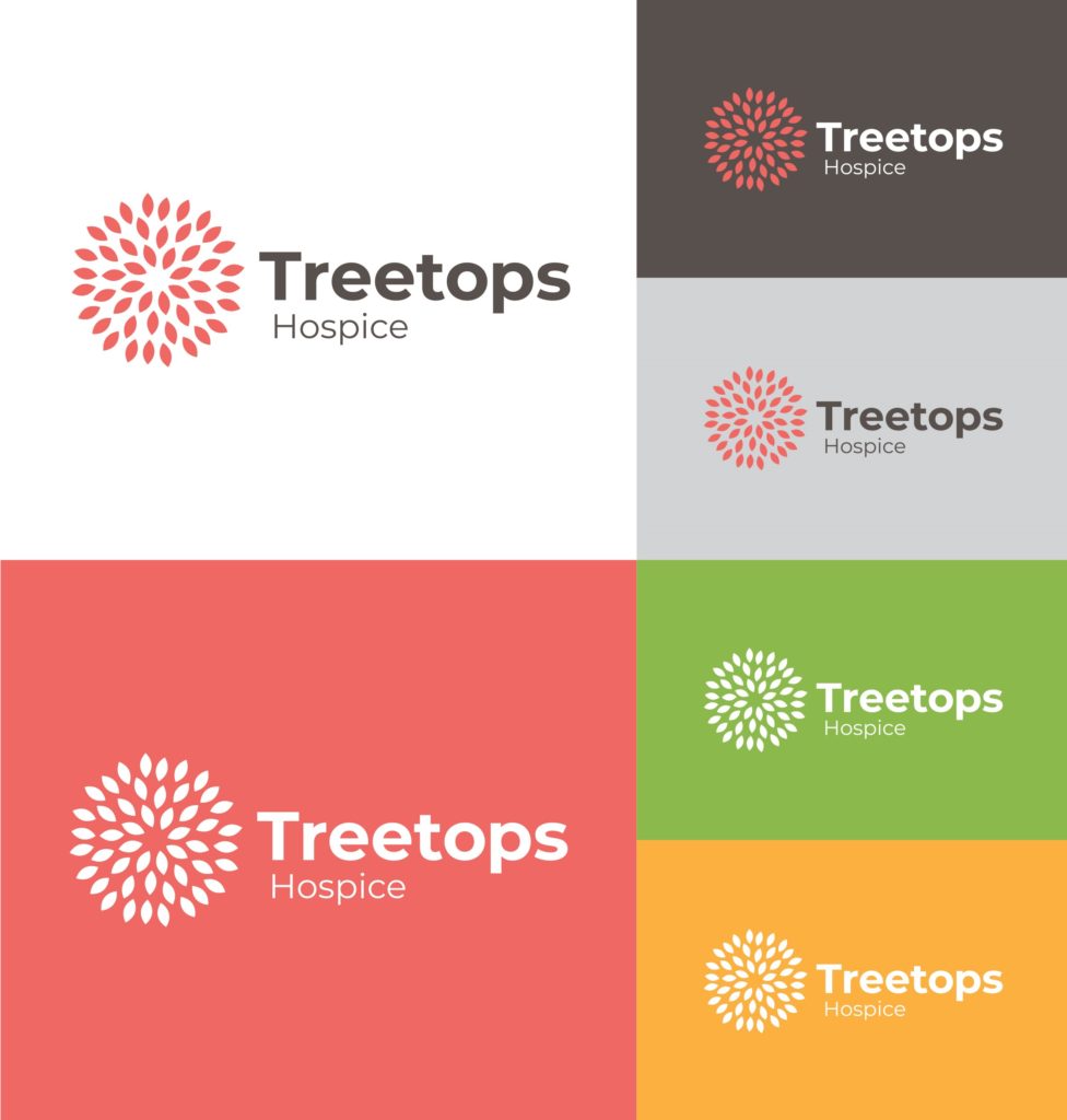
Our new logo is a recognisable overview of a tree. It reflects the concept of a community bonding together, compassion and warmth.
For our new colour palette, we took inspiration from Derbyshire and Nottinghamshire's natural landscape in autumn. Colours include a rich red, golden yellow and earthy brown.
What do you think?
You'll start to see our new logo and brand as we roll it out in the coming months. We'd love to hear what you think.
Here's what some of our volunteers have said so far:
I wish to congratulate everyone involved in the designs for the new Treetops Hospice brand. The result is so fresh and uplifting. It’s lovely in these rather depressing times. Our services have had to change to meet current demands. A new look will give a lift to our charity shops and interface with the outside world.
David Storer
“I love the new logo. It is fresh and actually rather pretty – absolutely brilliant!”
Jo Greer
The colour palette is inspired by the local landscape in autumn:
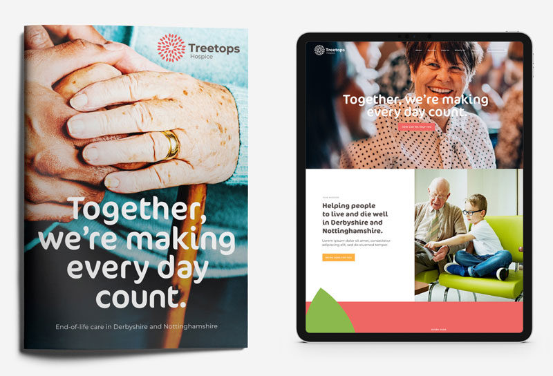
How our new brand will look on leaflets and online:
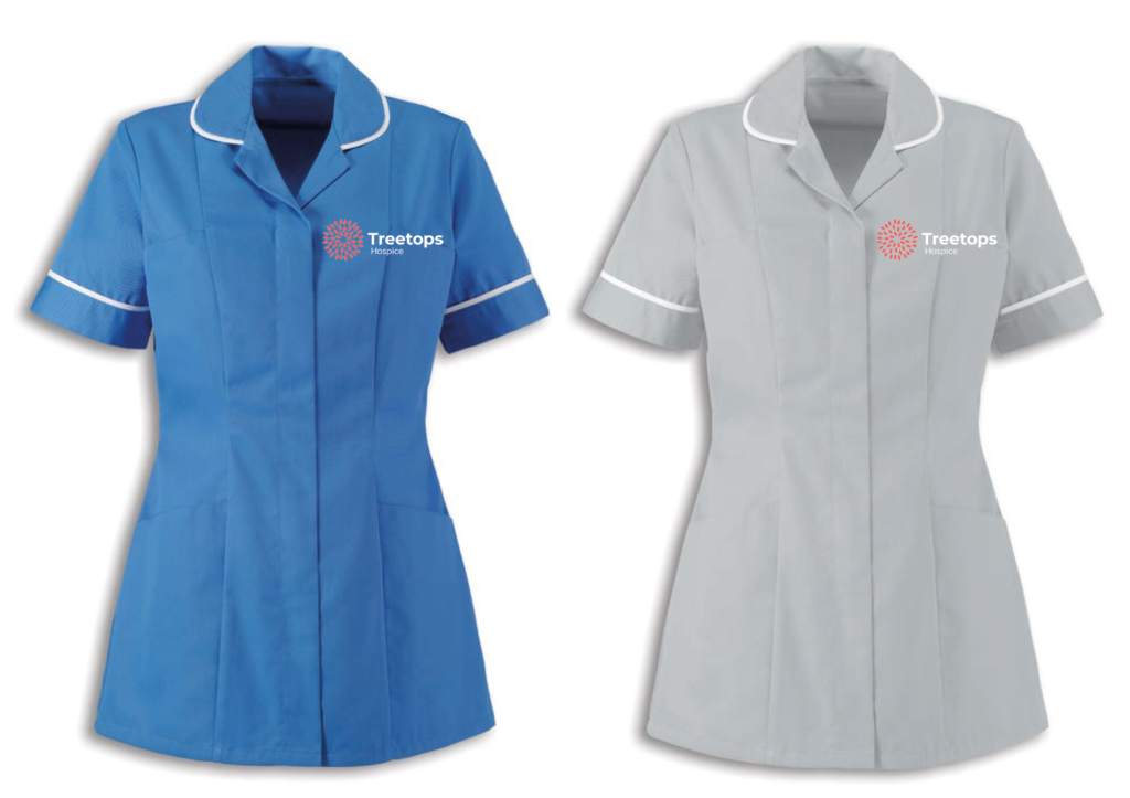
Our nurses will have smart new uniforms:
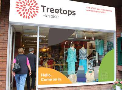
Our charity shops will get a fresh new look:
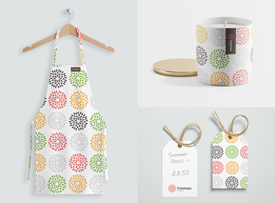
Merchandise could look like this:
